Thursday, 28 April 2016

End of Module - OUIL05 501 Summative Evaluation


In October it was hard to imagine that COP2 could go as bad as it had in Year 4, but a lot of it has.It certainly hasn't been a whole lot better that's for sure.The Roland Barthes study task summed up the majority of the academic side of the module: "I don't know what I'm doing, this makes NO sense and never will".


It's hard to find much to say that differs from my COP1 evaluations.I encountered the same basic issues from minute one. I found the few things I'm really interested in weren't really worthy of having an essay written about them, no matter how hard i tried to shoehorn them into my research. My essay question seemed to change on a weekly basis, and for a long time was way too broad to keep within the 3000 word limit. Even though clearly struggling hard with getting going, or being able to focus on a particular subject i was hesitant in seeking help from student support. It got to the stage when i finally did seek out support and i wish i'd done it sooner as i found the sessions really useful in helping me to make my essay question more focused. Also was good to have someone look over my word structuring, referencing and quotations for the purposes of submitting. Going forward i'll sign up for support sessions from the 'off' on COP3, as I'm still a huge essay writing amateur, and most of the time it feels like i don't know what I'm doing. The final essay moved totally away from being about art and was more about history, which i hadn't planned for and won't be something i'll be repeating next year, as it made finding actual history books in the library, as opposed to art history books, quite hard to find and reference, and i had to rely largely on articles found online - but it possibly lead to more interesting results regarding the practical response.


My strengths were always going to be in producing the publication - even though we were always told its not about the final result, but more about the idea. But as my written response will more than likely drag my marks down i needed to make the maximum effort to produce a publication that not only looked good but had well thought out concept, something that I'm not always guilty of doing. I was always conscious of not simply illustrating my essay, but i think possibly i might have gone too far in the other direction. The publication does have a link to contents of my essay, but whether anyone (apart from myself) could find those links is another matter.


When i did get up & running and enthusiastic about my publication ideas i found i really became inspired by the thorough research i was doing. The research,as with the essay was a look entirely into the past, so you could say that that's a connection between the written and practical responses.However, the delays in getting up and running with my essay (which resulted in me missing the draft essay hand-in deadline) lead to delays in me getting cracking with the practical response, so by the time i was really getting stuck into it and was coming up with ideas quite freely, it was time to wrap the project up and submit. Which was massively frustrating, but again, i could see that happening from the beginning, which makes it even more frustrating.


So apart from the last couple of weeks working on the publication i can't I've enjoyed any of the past 7 months struggling to gets things done on this module. Much like in Level4 I don't feel I'm learning a whole lot to benefit me beyond the degree, no matter how much the tutors tell us it will, and now the wheels of COP3 are already in motion, with the twitching body of COP2 still warm, I'm facing the thought of writing a 9000 word dissertation about 'anything' (as long as i can keep it art related) with some considerable trepidation. Which is a shame as, after speaking to a few of the year6 students, they've said what a great module it is in the 3rd year.Some even said it was the best module! I couldn't be any further from thinking the same, although i appreciate it will be a great opportunity to make some impressive looking work, with some real thought behind it, backed up and connected somehow to my written work. I know for one thing; I'm not going to be able to leave it all until so late in the day to complete that one.


But the struggle to find something I want to write about has already begun and is very real and terrifying.


Tuesday, 26 April 2016

Shop Lifted - Final Print & Evaluation

Only the second publication I've printed & bound and although it's not been as 'pro' executed as i would've liked, it's not a total write off. I was advised to use 200gsm stock rather than the 300gsm i was intending too. This was down to the fact that 300gsm paper isn't designed to fold, so when it is folded it starts to flake and crack. It was a handy tip-off, but i was a bit worried that the final book, when stapled together, as its only a small amount of pages would be a bit flimsy & not feel as professional. But better to be too thin than to have my design work flaking all over the floor.


Just when i thought i'd got through all the PRINT/FOLD/STAPLE/TRIM process steps without fault, alas inexplicably i came unstuck at the final step; using the 'big handle' guillotine! 

Straight off the cutting mat (after 'surgery')


For reasons beyond me, it was trimming the edge of the pages with a curve - so i had to go in and perform some manual surgery on the individual pages, whilst they were all stapled together. Not ideal, and it's left my book a good few millimetres smaller than it should be, but i'd over-catered for trim on my images so it didn't disrupt the final appearance too much. The staples job wasn't as tidy as i'd was aiming for & it was my first time using the folding machine as well and the creases in my belly bands weren't as crisp and accurate as i could've hoped for.

Belly band selection

It was a good call on my behalf  booking that back-up print slot, as ideally i'd like to try again and iron out the problems, but as we were told last week - 'You can't polish a turd' - if it's a shit idea, it's still going to be shit no matter how well you fold/ staple/ trim that shit. So i may stick with what I've done, rather pile on the pressure of doing again but better, only to mess it up again, and waste time i should be using to finish of the rest of the module. 

There, i said it - "i'm leaving something as it is, I'm not going back in to try and perfect it."


Unsightly trimmed edges aside, I'm fairly happy with the final outcome. Had i 'got going' earlier on with the practical response then i would've taken more time to consider the materials of the book pages in general. I realise its only a few pages, but I'm not sure if what I've done feels enough like a publication? Having said that, an initial afterthought i had was to have printed it in the style of a fold out promotional leaflet - like you find in supermarkets and that get posted though your letterboxes. In which case the paper only need to have been super thin, and shiny. All this makes me more annoyed that i was so slow off the blocks - as I'm sat here typing about other ways i could've presented my publication, but I've run out of time to actually investigate them and try them out. The more i think about it, the fold out ALDI flyer approach may have been a more effective solution. 

I'll have to (again) put this one down to trial, error, and pulling my finger out early doors!


-----------------------------------------------------------------------------------------------------------------
*UPDATE*

Ok, so i did use my extra print slot to make the wrong things right, and I'm glad i did, as that extra bit of perseverance paid off. There were no wonky trimming issues this time around (as i used the standard guillotine, one page at a time.) Took my time with the folding and stapling and made the cover larger than the inside leaves as i'd initially planned. I'd also earlier indicated that i would perforate all the pages to add to the 'take what you want' aspect of the book, which would allow to reader to tear pages out of the book if they so wanted to put them in a frame. I was apprehensive about trying this out on the original print out, as i only had the one - but now i had a new and improved copy i went ahead and tried it out. I'm glad i didnt go ahead and use it on the final submission, as although it may help with the general theme of the book, practically speaking I'm not sure it really worked. 


The stock being quite thick didn't really perforate that well and when torn looked a bit tatty, without a clean 'tear'. Plus i was concerned that after continuous page turns, the pages may accidently get pulled out anyway, so i made the decision to let this idea go. I did also redo my belly bands on a thinner stock which was much easier to fold around the book without creating scruffy looking creases. 


All in all i'm a lot happier with the final results.See.


Monday, 25 April 2016

Shop Lifted - final artwork production


With the weekend devoted to smashing out as much of the imagery for this book as humanly possible, i now find myself with an almost ready-to go publication, in time for my print slot on Tuesday- which i'd booked at the beginning of the Easter break to avoid disappointment. I'd also booked up a backup slot the day after just in case the initial slot went pear-shaped. It's about the only definite plan i've had for this whole module to be honest.


 (draft version >>> vectored finals)


I'd come up with a couple of different cover designs. Initially i wanted to keep things quite minimal and stark, and played about with the logo & some 'cut & paste' barcode patterns. I'd also used one the product images that didn't make it into the actual book and converted into a cover design, as not to waste it. As mimicking has been a constant theme, the title has been deigned to resemble the original product label. I decided that the Ketchup cover is more in keeping with the tone of the rest of the book, but I've still incorporated the Shop Lifted 'branding' in other parts of the final layout design, namely the belly bands - of which again, there were several options to choose from (demonstrated below).


All three belly band designs fit the bill - the first design would require a bit more 
fiddling about with once printed with if it's to line-up exactly with the bottle image on the book cover. But i can print a number of them out and make a decision on the day. Book making and the bells & whistles that go with it isn't my specialist field, so may need few takes to get it right. That's not a problem with the belly bands, however i can't really afford to mess up the folding/binding/trimming of the actual book pages.


Final layout & content (including belly band)

Friday, 22 April 2016

Publication Development

As i set about producing the rest of the digital 'scamp' imagery that would form the content of my book, i also took a bit of time to try and formulate some sort of title for it. That came in the form of a very quick word association mind map thing, which was basically some scribblings in my notepad. But it did the trick!


BOOK TITLE GENERATING: KEY WORDS

• Rework • Borrowing • Steal • Twist • Minimal • 
Extracting • Abstracting • 'take what i want' • Product • Barcode •Digital

From these starting points, which are all words that refer to the contents within the book, there were two final possible titles to chose from.

EXTRCT > ABSTRCT
Referring to the fact that i'm extracting the bits i want from these products, then making abstract, digital images from them. The missing letters also reflect  the 'extracting' of the parts i want to make something different, but still recognisable. 

SHOP LIFT/ LIFTER/ LIFTED
Based on shop bought items - design mocks made using photoSHOP - I've 'lifted' the parts i want from these shop products, as a shoplifter would. 


After the draft imagery was completed and ready to be taken to the vector stage & whilst the ideas were still fresh in my mind,i played about with a simple logo/type treatment to go onto the front cover of the publication. I went with the SHOP LIFTED title as i felt it related more specifically to what i was doing here: 'stealing' (borrowing). The addition of the Mac PhotoShop hand-grab icon is to indicate the connection to digital art & the 'taking' of various elements to compose my own. 


Below is the mock-up book, of the mock-up designs that will be making for my final publication. I keep referring back to the quote by Ashlee Rubenstein, which I've also included at the front of the book. It may not be this 'famous quote' from a world renowned figure, but her words reflect exactly what I'm doing here - they also reassure me that what I've done isn't just copying the packaging of popular consumables, even though it is, a bit.

Thursday, 21 April 2016

COP2 - final peer review

Just when I've started to get going with some publication ideas, it's come to the last week before submission, as predicted. I'm really annoyed at myself for not coming up with the concept and the motivation earlier, as I'm enjoying the research, experimentation, and the actual subject matter with this, and it's frustrating that I've only given myself a short amount of time to develop it. 

Getting a chance to look at the rest of the class' efforts was interesting - the majority seem to be in a similar boat; of having a number of rough ideas but nothing too developed or decided on, so it was hard to comment on some of them. On the other hand, i saw a number of books with a tonne of research & development, and felt rather envious of their (COP) time management skills, along with the general abitly to generate lots of ideas based on their essay. I had some positive feedback about my sketchbook offerings (which are fairly developed, just not exhaustive) and some valid questions;

"We can't follow the link between your essay and your practical work so far"

Fair point. I could see this being a problem without people having read my blog posts explaining the very, very slight connection between my practical work and my essay. I should've made some notes about it in my sketchbook as a short explanation to my thinking behind it all.


"How have i moved on from the first proposal to the second? What made you change your mind? Is your research still relevant"

The 1st proposal was the result of only having the most basic notes and ideas for an essay (when i should've been at the draft essay stage). The essay question was altered several times, but american B-movies and remakes still featured in there - albeit very briefly. My first proposal would've been exactly what we weren't supposed to do; illustrate our essay. With the new proposal and direction for the publication it's gone as far away from essay subject as you could go, whilst making sure there is somewhat of a connection to it.

"What is the title of the publication going to be. Does it have a message or purpose?" 

Another good point. Although i hadn't forgotten about it, coming up with a title for the book is something i hadn't considered much as yet. I figured when all final imagery starts coming together then a suitable title will evolve. But it will have to be something that sums up what I'm trying to achieve, what i will have produced, as well the subject of the contents inside the book. I'm usually pretty good at coming up with media friendly, soundbite titles for my work so it's not something I'm fretting about too much yet. As for a message or purpose, i'd say it's message is to show how you can take away the majority of fine details from familiar everyday objects/products, to the point where they're reduced to merely snippets & squares of colour, but the viewer is still able to tell what the object is through the careful placement and colour of these shapes. It will also be my own take on the existing items, influenced by the work past abstract & minimalist artists.    


Theres still plenty of time to get get this complete though, and i'm not feeling any panic just yet - I've got to the point where think I've settled on how i want the imagery to look, i have some quite well developed draft versions of some of the pages so i know what i need to do - its just a matter of of fast i can knock 12 pages of designs out, and how much time faffing i'll need to cater for. Ive gone down the minimalist avenue so in theory it should be achievable by next Thursday  but I'm sue ill come up with new ideas and design solutions between now and then to give me some decisions headaches, but this weekend is crucial.If the majority of the imagery is done & dusted by Monday i think I've given myself a good shot at submitting in completion on time. Well, the practical side anyway - if all goes to plan then this will also give me enough time to finish off the written response. 


The thinking from now 'till submission next week will be; 
"Plan the dive (work), dive (work) the plan" -F.Bates 

and to basically 
GET ON WITH IT! 

Monday, 18 April 2016

Publication Development

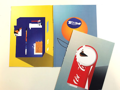
Moving on from focusing purely on one particular object in various different art 'styles', i looked into choosing just one of the styles i'd been researching into (minimalism,abstract), and using it to illustrate a selection of well-known, somewhat iconic design classic items, found in your local supermarché. The thinking behind this is; can i minimalise these referenced objects into the most basic of shapes but still render them identifiable to viewers? 

So, taking just the parts that interest me, and making them into something new, yet still distinguishable.


ABOVE: Product reference images. I've only got 12 pages max to play with, 
so i'll have to whittle the selection down. 


>>>>>>>SKETCHBOOK THUMNAILS<<<<<<<


The sketchbook thumbnails were the springboard to the next step which was to knock-up super quick collages in Photoshop of the compositions i wanted to make for the book. The thumbnail sketches were a good initial starting point, but for the approach I'm taking with this, the photoshop mockups are essentially my thumbnails - as i can make selections, cut and paste, and re-paste, and re-paste until i have a clear ideas of what i want to develop for the final piece, just as quick, if not quicker than trying to visualise it in my actual sketchbook.


Above: examples of the basic digital mock-ups.

Mini book layout mock.

I started to think a bit about the layout of the book - not that it was going to be this big, technical production (regular stapled book, with belly band set-up), but just so i hand an idea of how many full-page images i'd have space for, where any blurb/quotes may go etc. Also, to continue with the theme of 'taking what you want', i've planned to perforate the pages so the reader can 'take' any images they like (for displaying/framing) whilst leaving the rest behind.  


Friday, 15 April 2016

Sketchbook development work


After bringing together a selection of artists examples i set about just trying to replicate them - not necessarily using the same materials ( i wasn't about to bust the oils out - I've never busted the oils out) but trying to achieve a similar looking piece with whatever tools i had available, but much more scaled down. I did however get a bit of acrylic & ink painting going, which is something that i haven't taken the opportunity to do much this year. Even if it was only to study the work someone else had made, i still felt that i was learning how the original artist may have one about making these particular pieces. Some of them were obviously easier to replicate than others - the Keith Haring trademark style came very naturally to me, due to it's bright colours and thick line work, which are already quite prominent in my practice. Hofmann's abstract brush work, i imagine, was pretty spontaneous - however for me, as i was trying to imitate every brush mark and paint blend, it turned into a meticulous, carefully executed operation. The minimalism of some of Klee's work however is what really started to inspire me to try and head in a stripped down approach. Rather than replicate the actual paintings of other others, i looked for a subject matter that i could draw/paint in the 'style of' those artists, but hopefully give them a new twist. 


TOP:Hofmann art study. My effort on the right, obviously!
MIDDLE: Paul Klee x Heinz Ketchup.

BOTTOM: Keith Haring x McDonalds art study.


It occurred to me that i could then possibly draw a globally recognised object over and over but in the style of these various painters. A design classic like a donut or a hotdog. Something pretty simple, but would be intanstly identifiable my pretty much anyone (well, anyone who knows what a donut or a hotdog is).


Monday, 11 April 2016

Essay - As it stands.

In no way complete. Needs the quotes adding to & sorting out and images added. Can't find many,if any quotes form actual books that have any relevence to what I'm writing about its all come from online articles - this essay has shifted more to history than art, and our library is more geared to the art side of things, just how it should be. Still doesn't really help with the practical side all still to sort out ,and there's absolutely no sketchbook work to speak of.

Not sure there's a whole lot of point of me trying to avoid a re-submission at this point.

Good times.


My essay, as it stands.

Friday, 8 April 2016

Artists aesthetics research

It may seem a bit like something you'd do in at school, in art lessons, (and i probably haven't done this since i was a t school)but i just went a looked up a whole list of famous artists from the past, who all had different but distinct styles, and made myself familiar with some of thier works. I'm contanstly looking to the artists that i follow on instagram,or online for inspiration - but it struck me as i was researching, that i've totally forgotten to look backwards, at the real pioneers and to 'take' inspiration from how they produced their work. I was especially drawn to some of the abstract & expressionism painters, namely Paul Klee & Hans Hofmann,Kandinsky also. 
above & below: examples of Hans Hofmann's work


Paul Klee 'portrait of an equilibrist'


Kandinsky 'Braunlich'

Their combinations of loose & wild brush strokes with the additions of controlled,sharp digital-eqsue lines & squares of bright block colour instantly resonated with me; as someone who has been striving to find a way of producing work with both an analogue & digital tone & process to them. Several of Hofmann & Klee's pieces are perfect examples of what i would like to be achieving in my own practice. Hofmann's work, which before now i'd never been aware of, also struck a chord with me; as looking at his work and mine,its not initially clear what its about, but the colours, media and composition are what keeps me looking at it, which is similar sounding feedback that i tend to recieve a fair bit when tutors/peers review my work.

Amongst other distinct styles i investigated below include: Keith Haring, Picasso & Andy Warhol.


With all this new inspiration in front of me, i now need to find a way of incorporating the 'borrowing' aspect to it all, without just simply creating a book of 'imitation artwork', produced by a guy with vey little paint know-how (me).   

Sunday, 3 April 2016

New Practical response proposal

With the change in my essay question a re-think of my practical response proposal was needed.

THEMES I AM GOING TO EXPLORE...
1. Transcription of art

2. Re-imagining / Copying / Mimicking / Parody

3. Modernisation of production process - replication of old artists techniques 


THE THEORIES THAT WILL INFORM MY WORK ARE…
1. Books about the 'past masters' & artists throughout history, namely abstract artists. Also specific art movements.

2. Articles regarding transcription of art, 'borrowing', rip-offs, parodying. Also copyrighting issues.

3. Online stores selling parody artwork and apparel, to see how much is out there and of what sort of quality.


THE SPECIFIC SUBJECTS THAT I WANT TO INVESTIGATE…
1. The 'borrowing' of other peoples work and production process' in order to create their own work.   

2. Minimalisation of imagery, but keeping it recognisable without becoming too abstract.

3. Imitating other art 'styles' with everyday objects.


IN ORDER TO VISUAL INVESTIGATE THIS CONTENT I WILL…
1. Research into various artists from the past and their production processes.

2. Find books, example of abstract art - study it & practice mimicking it.

3. Read articles, magazines  etc.. about the parody/pop culture art 'scene' - peoples views on it and the artists who are practitioners in it.


Friday, 1 April 2016

Quote research

Finding any books in the library about pure history isn't going well - all of the relevant info & quotes have been found within various online articles, some of the don't even have a authors name,(which i trying my best to avoid using) so I'm a bit concerned about that when i comes to adding them to my essay and Harvard referencing them.


Almost as soon as World War II ended, developers such as William Levitt (whose “Levittowns” in New York, New Jersey and Pennsylvania would become the most famous symbols of suburban life in the 1950s) began to buy land on the outskirts of cities and use mass production techniques to build modest, inexpensive tract houses there. The G.I. Bill subsidized low-cost mortgages for returning soldiers, which meant that it was often cheaper to buy one of these suburban houses than it was to rent an apartment in the city.


(http://www.history.com/topics/1950s)


While the economy boomed and consumerism pervaded the culture, anxiety and tensions belied the surface placidity of 1950s society. Fear of Communist expansion abroad and subversion at home, as well as of nuclear war, shaped American life in profound ways. As the long conflict with the Soviet Union took shape in 1946-1947, American society became increasingly obsessed with communism, disloyalty, and dissident opinion generally.

http://ic.galegroup.com/ic/uhic/ReferenceDetailsPage/DocumentToolsPortletWindow?displayGroupName=Reference&u=oldt1017&u=oldt1017&jsid=347c2091a080fbd71aebaad95d411063&p=UHIC%3AWHIC&action=2&catId=&documentId=GALE%7CBT2313026907&zid=dbaf8355e54c396b9af1f64d3a9cea8c


It was one thing to ponder a map, something else to traverse the boundless countryside, as Field Marshal Manstein remembered: "Everyone was captivated at one time or other by the endlessness of the landscape, through which it was possible to drive for hours on end – often guided by the compass – without encountering the least rise in the ground or setting eyes on a single human being or habitation. The distant horizon seemed like some mountain ridge behind which a paradise might beckon, but it only stretched on and on."


http://www.historyplace.com/worldwar2/defeat/attack-russia.htm


The Cold War was a world war, some have argued even more so than the World Wars themselves.  It drew in many people and economies and saw fighting in more places than the Second World War, including the Middle East, Asia, Africa, South America, and Central America.  Millions of people did actually die.

https://secretsofcoldwarradar.omeka.net/exhibits/show/background-material--the-cold-/what-was-the-cold-war-/a-brief-introduction


Truman was told by his army generals, Douglas Macarthur and Dwight Eisenhower, and his naval chief of staff, William Leahy, that there was no military need to use the bomb.
“Impressing Russia was more important than ending the war in Japan,” says Selden. Truman was also worried that he would be accused of wasting money on the Manhattan Project to build the first nuclear bombs, if the bomb was not used. 

(edwards, 2005)


Charlie Chaplin was such a worry to the FBI during the Red Scare that J. Edgar Hoover tried to have him deported. When he left the country in 1952 to promote his movie Limelight, Hoover collaborated with the Immigration and Naturalization Service to revoke Chaplin's re-entry permit. Instead of fighting it, Chaplin made the choice to stay in Europe, making his home in Switzerland. He issued the statement,

"...Since the end of the last world war, I have been the object of lies and propaganda by powerful reactionary groups who, by their influence and by the aid of America's yellow press, have created an unhealthy atmosphere in which liberal-minded individuals can be singled out and persecuted. Under these conditions I find it virtually impossible to continue my motion-picture work, and I have therefore given up my residence in the United States."
He only ever came back to the U.S. very briefly "“ to collect an Honorary Oscar in 1972.


McCarthy cared little about the accuracy of his accusations, and he made heavy use of intimidation and innuendo. Nevertheless, his complete disregard for the truth only made him more powerful and frightening
McCarthy, like many other red baiters, greatly exaggerated the domestic communist threat.

https://www.gilderlehrman.org/history-by-era/fifties/essays/anti-communism-1950s   


The film’s place in history certainly intimates that the pod people represent communism, stripping away all that’s American from small town America (“love, desire, ambition, faith – without them life’s so simple, believe me”), as well as an arguably contradictory reflection upon the red scare.


As a genre, sci-fi peaked in the l950s as a result of several political reasons. First, there was a renewed interest in outer space. Second, there was fear of the atomic bomb's destructive power. Moreover, because of McCarthy's witch-hunting, filmmakers feared to comment directly on current social problems, instead turning to “safer” stories, such as sci-fi and Westerns, using both genres as political allegories.

(Levy, 2006)

site>> http://emanuellevy.com/comment/invasion-of-the-body-snatchers-as-political-allegory-4/